1-2 wk

Read
We defined type hierarchy, reading rhythm, and visual tone.
ExploreSystemDelivery
 View page
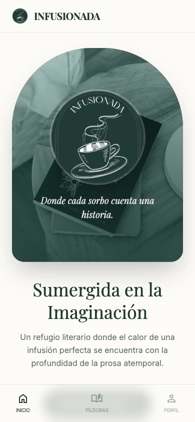
We designed a quiet editorial space for creative writing, with an interface that protects the reading experience and keeps a distinct identity.
We defined type hierarchy, reading rhythm, and visual tone.
We created pieces for articles, archives, navigation, and featured content.
We refined responsive behavior, performance, and small interactions that stay out of the way.
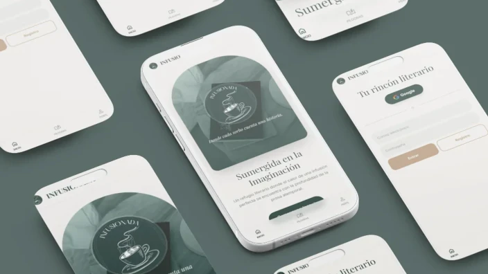
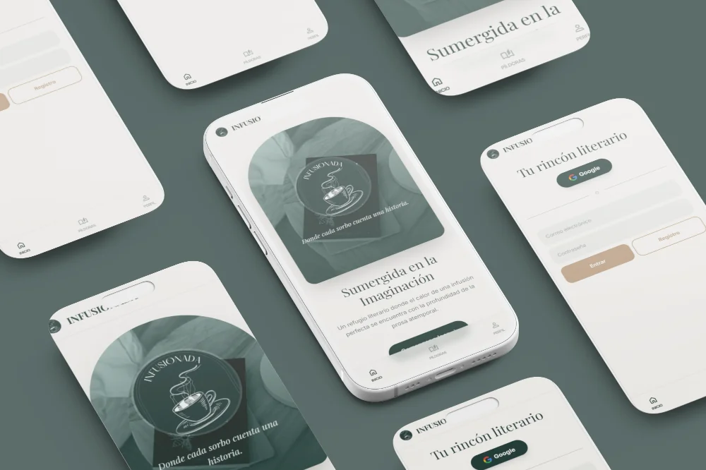
Early UI concepts and visual explorations.


The site needed to feel intimate and considered without becoming a generic blog or an overly decorative layout.
Visit project
The structure supports orderly publishing and keeps archive, reading, and discovery experiences clean.
Gallery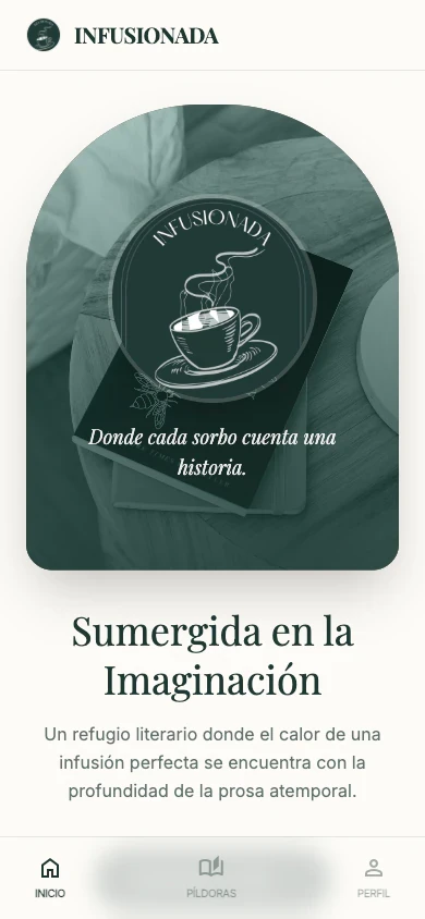
Keep scrolling to continue


